Introduction
Gnuplot is a feature rich command-line graphing utility available for Windows, Linux and Mac OSX. Though capable of generating much more advanced formula-based plots its also very handy at producing quick, ad-hoc time series graphs.
The Test Dataset
For our example we'll use the following basic dataset saved to file 'mydata.txt'
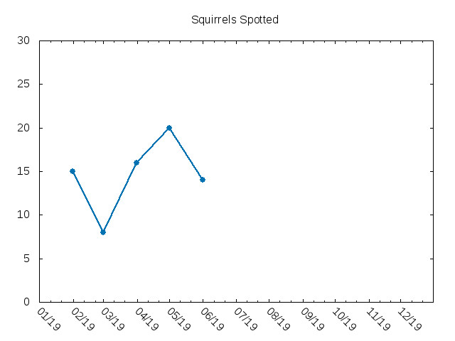
2019-02-01  15
2019-03-01   8
2019-04-01  16
2019-05-01  20
2019-06-01  14
Gnuplot Commands
These commands were tested with gnuplot 5.0 patchlevel 5
set xdata time                           # Indicate that x-axis values are time values
set timefmt "%Y-%m-%d"                   # Indicate the pattern the time values will be in
set format x "%m/%y"                     # Set how the dates will be displayed on the plot

set xrange ["2019-01-01":"2019-12-31"]   # Set x-axis range of values
set yrange [0:30]                        # Set y-axis range of values

set key off                              # Turn off graph legend
set xtics rotate by -45                  # Rotate dates on x-axis 45deg for cleaner display
set title 'Squirrels Spotted'            # Set graph title

set terminal jpeg                        # Set the output format to jpeg
set output 'output.jpg'                  # Set output file to output.jpg

plot 'mydata.txt' using 1:2 with linespoints linetype 6 linewidth 2
Running Gnuplot
Although you can paste the commands above right into gnuplot, it usually makes sense to put these commands in their own file for future reuse and reference. If we put these into the file 'gpcommands.txt' then we just need to run:
$ gnuplot < gpcommands.txt
To have it generate the following plot:
Bonus Example: Multiple Series
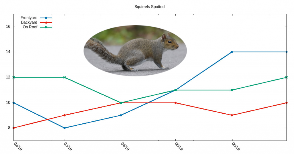
The above is a good demonstration of how to create a minimal time series graph, however often you'll want to chart multiple series together. Lets adjust our source data file to add two more series (as represented by columns) and one more row as we'll be widening the dimensions later:
2019-02-01  10  8  12
2019-03-01   8  9  12
2019-04-01   9  10 10
2019-05-01  11  10 11
2019-06-01  14  9  11
2019-07-01  14  10 12
For the gnuplot commands we'll add a bit of polish:
- Shortened date range on x-axis
- Shortened value range on y-axis
- Add the legend (aka key) to the top left
- Increase the size of the plot title at the top
- Change output image dimensions to 1200x600
set xdata time # Indicate that x-axis values are time values
set timefmt "%Y-%m-%d" # Indicate the pattern the time values will be in
set format x "%m/%y" # Set how the dates will be displayed on the plot
set xrange ["2019-02-01":"2019-07-01"] # Set x-axis range of values
set yrange [7:17] # Set y-axis range of values
set key left top # Set lengend location to top-left
set xtics rotate by -45 # Rotate dates on x-axis 45deg for cleaner display
set title 'Squirrels Spotted' font ",18" # Set graph title, set title font size to 18
set terminal jpeg size 1200,630 # Set the output format to jpeg, set dimensions to 1200x630
set output 'output.jpg' # Set output file to output.jpg
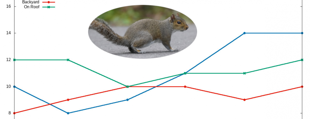
plot 'mydata.txt' using 1:2 with linespoints linetype 6 linewidth 3 title 'Frontyard', \
'mydata.txt' using 1:3 with linespoints linetype 7 linewidth 3 title 'Backyard', \
'mydata.txt' using 1:4 with linespoints linetype 2 linewidth 3 title 'On Roof'
After this plot image was generated, I pasted a small squirrel picture using an external image editor to complete the image. Although it's somewhat possible to add a background image using gnuplot, the general consensus is to use your favorite image editor instead as it (GIMP is an open source, multiplatform option for those on a tight budget).
Final Thoughts
Although there are other graphing libraries and software that may plot time series graphs in a more visually appealing way there are few-to-none that match gnuplot's efficiency. More often than not you'll just need something that will visualize a set of data points thats 'good enough' and for this reason gnuplot is a very effective tool to keep in mind.